
Emerson College introduced its new logo and graphic identity for the school in a meeting last Tuesday.
It’s the college’s first comprehensive rebranding initiative since 2004, and the effort was originally announced in fall 2013. Emerson gathered information using surveys and focus groups with the higher education group Simpson Scarborough, hired last year. The college held focus groups prior to creating the logo, and one after they had decided on it. After working with Ologie, a branding agency, the college announced the release of the graphic identity in an email, inviting the school community to attend.
In his introductory speech, President M. Lee Pelton said that the process was long, but it was just beginning as the college prepared to transition into using the new logo. He also clarified that though the logo was open to input, the college’s use of it would not be up for debate.
“It’s not American Idol,” Pelton said. “You can’t vote on it.”
Pelton then introduced Matthew Yuskewich, the executive creative producer for Ologie, who said in considering the design they wanted to capture the key facets of the school–– traditional yet modern, bold yet elegant, and reflective of a collaborative community, Yuskewich said.
“We tried a lot of things, kind of pushing both of those edges, and I think we ended up somewhere in the middle,” Yuskewich said.
Yuskewich said they wanted the design to feel like imperfect human work.
“It feels to us as if it was created in a moment of inspiration,” Yuskewich said. “It’s a living breathing thing, and it can change as it needs to, to evolve for the school.”
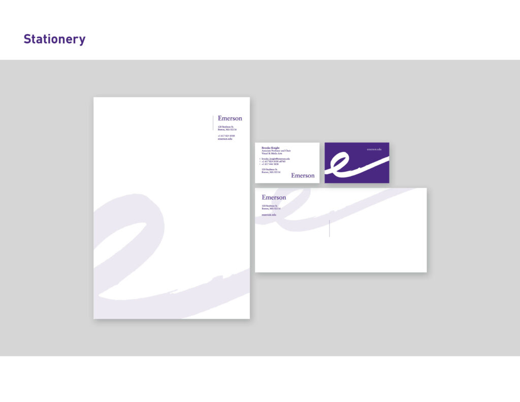
Yuskewich also demonstrated how the logo could be used in a variety of ways. He showed examples in which the “e” framed a photo of students, and different ways the logo could be cropped.
“[The logo] can be creative in how they use the flourish,” Yuskewich said. “It can also sit in the background [of stationary and other placements] as a quiet reminder of our identity.”
At the meeting, Gregory Payne, a communications studies professor and chair of the department, said he thought the new visual identity captured the spirit of the school.
“As someone who has been here for a while I’d like to say this is very crisp, very bold, very creative—and I’m very excited,” Payne said.
Andrew Tiedemann, vice president for communications and marketing, said on Wednesday that he was very happy with the meeting and felt it had a very positive response.
“I’ve never seen another college logo that has the movement and dynamism of this logo,” Tiedemann said in an interview. “We can use it in so many different ways and so many different placements whether it’s on the website or in a publication.”
Tiedemann said the rebranding committee intends to present the logo to the Board of Trustees in early May, and that they also hope to present it to the Board of Overseers and the Alumni Board.
Tiedemann said the website, which was recently updated with a goal of being more mobile friendly, will also receive a makeover to align with the new logo.
Following its launch, images of the logo spread throughout the Emerson Mafia Facebook group as students and alumni reacted to it. Several made memes based on the image, comparing it to an awareness ribbon, a pig’s tail, and a Dixie cup.
Sierra Watson, a freshman journalism major, created a Change.org petition on Friday asking Pelton not to use the new logo. Watson said she saw a lot of people talking about it but not doing anything. She said she feared that without action, there would be no change.
“I didn’t think it was a good representation of our school,” Watson said. ”I didn’t think it was collegiate, and I didn’t think it was representative of a higher education institution.”
Pelton responded with an email sent to the Emerson community on Saturday and said the singular image that was being circulated—a version of the logo projected at Tuesday’s presentation that was published in an opinion piece by the Beacon’s editorial board—did not represent the potential of the new logo.
“Let’s at least give our community a chance to see the visual identity in the fullness of its display(s) and uses rather than a fuzzy little squiggly image of an image of an image projected on a screen,” Pelton said in the email.
Pelton also said that the college was working with Ologie to create a slideshow to virtually present to the community so they could see the full visual identity.