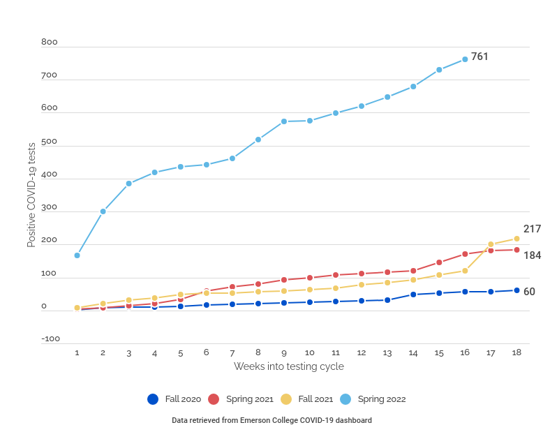
Emerson’s cumulative positive COVID-19 test results have risen steadily each week, as seen in the graph above.
Each point on the graph represents the number of cumulative positive results the college reported at the end of each respective week. The lines in between the data points represent the number of positive tests reported each week.
While the college opted to provide the community with daily updates starting Sept. 8, those updates have come sporadically and appear two to three days after the tests are administered. The data included in the graph is the most complete picture of Emerson’s positive testing numbers available to The Beacon at the time of publication.
The college’s testing dashboard, which is intended to collect and display community testing data, has often temporarily displayed inaccurate or incomplete data. After testing updates are posted, the data listed on the tracker will change to numbers different from what was listed hours before. Sometimes the changes reflect new data from the Broad Institute; other times, it fixes previously made glitches, mathematical inconsistencies, and reporting errors. This graph has data points to reflect those discrepancies.
Note: Sept. 17, 2020: A previous version of this story lacked information regarding the blue and purple lines in the data visualization above. This story has been updated to account for what each line and datapoint represent.